First off, notice that Izzo's creations are all beautifully photographed. No blur, great lighting, neutral backgrounds, interesting camera angles, image sizes large enough to show all details but not over-large. It probably goes without saying that good presentation is the first thing in getting any LEGO creation noticed.
More specifically, looking at vignettes, I personally prefer creations featuring minifigs. Not that there aren't many great creations that either do not feature people at all or are at different scales - for instance, in Izzo's case, he has a hilarious Bart Simpson sculpture, a beautiful crane and a very poetic turtle scene - however this is just my personal preference.
As I've said before, vignettes are the haiku of LEGO building. By imposing fairly rigid constraints, these "slice of life" creations force the builder to distill a scene down to its very essence (and, like haiku, they first came to us from Japan). In my previous posting on what makes a good vignette, I mentioned four things I look for in the best vigs - use of space, action, storytelling, and humor. Thinking further on this, I suppose instead of "humor" I should have said "emotional impact," as some vignettes invoke feelings of sentimentality, sadness, or a simple sense of tranquility.
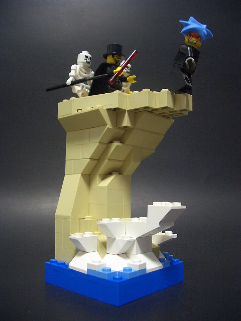
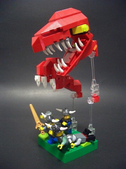
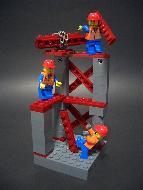
To see better how these qualities are put into action, first consider four of Izzo's vignettes -
"Candle in the wind (To have one's life hang by a thread)", "If you're in love, travelling a thousand miles seems like only one mile.", "Strategem 36: If all else fails, run away", and "To gain one of your nine lives back".


Use of space Both "candle" and "nine lives" use the vertical dimension very well. In the first the low angle of photography makes the fig's placement at the edge of the cliff seem very precarious and in the second placing figs on three levels gives a great impression of a construction site. Both "love" and "run away" do something different; by showing us parts of much larger objects (the subway train and the dragon), they allow our brains to fill in the much larger world around this little 8x8 plot.
Action None of these creations seems static. Each is like a photograph in that it captures an instantaneous moment in time - just as the beam is falling in "nine lives", or just as a wave crashes against the cliff in "candle".
Storytelling Even before Dunechaser provided the translations, the story in each of these scenes is clear. "Candle", for instance, is like a scene out of an old Saturday matinee, with our hero trapped by the evil villain. He looks over his shoulder to see if he can escape that way, but right then a wave crashes against the rocks below. How will he escape? Come back next week to see. In "love" you can tell that the man has been waiting on the platform for his loved one to arrive. She sees him from the window, and as the train stops she jumps off and into his arms. What really makes this scene for me, though, is the way the other figs have turned to see, smiling at this display of young love.
Emotion Again, each of these scenes is full of emotion. In "nine lives" it's that mixture of fear and relief we've all felt in the wake of an accident narrowly avoided. In "run away" it might be fear, but for any Monty Python fan it's probably more likely a hearty laugh. The tension is thick in "candle", and "love" evokes, well, love.
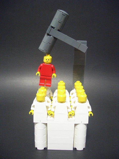
Most vignettes fit in the "slice of life" category and I would judge them by the criteria above. Some, though, are more abstract, trying to illustrate an idea in an artistic way. Unless you enter the tiger's den, you can't steal her cubs and The nail which sticks out gets hammered down are two of these.


For this type of vignette I look to how well the scene conveys the idea and the artistic merits. I have to admit that "tiger's den" probably doesn't succeed as well, but the sculpt of the tiger's head was so great I wanted to include it. On the other hand, "nail" succeeds beautifully. Putting the conformist figs in all white reminds me of a science fiction movie like THX 1138, and contrasting with the brightly colored nonconformist is very effective. It's also especially apt that the conformist figs are all faceless, in contrast with the red fig. This really illustrates well the feeling we've all had from time to time.
Anyway, I hope that gives some further insight into what sorts of things can make a great vignette. What do you think? I'd be interested to get others' views on this form of building.
4 comments:
I think you are spot on Bruce. You've got a real talent at expressing the sometimes difficult-to-explain world of LEGO Aesthetics. I think Vignettes are the most energetic and dynamic theme to develop from the AFOL world - specifically for the reasons you have given.
The other great reason is that they are also the most accessible theme for newbs - anyone could build a good vignette. Of course, not everyone does - they are much more difficult to get right than most people think.
-Lenny
Thanks Lenny,
If only my building lived up to my commentary. Of my vigs, I really only think that Black Diamond really succeeds at all four criteria. I feel that my others are partial successes - for instance, the Rosa Parks one does well (IMO) at suggesting the larger scene, but it feels kind of static to me; several of the track and field ones get the action down, but are lacking in emotional depth; I'm quite happy with the morning fix one, but the use of space isn't so good, etc.
Bruce
Bruce,
I have a great emotion after reading your commentary (but it's hard to understand what you say).
And, I admire and agree with the conception in such high-class aesthetics on your mind.
Especially, about Storytelling, you are the best one to realize what I want to say on my vigs. There's no people to write on clearly as you, even in Japan! I can't thank you and Andrew enough.
By the way, I found out "Brick Tales" and really enjoyed it. What an exciting, amazing and sophisticated articles you do!
(About vigs, Jaws poster and Superman are really fun!)
I would have its bookmark on my home page. I'm looking foward to see your new works on the HP and your great sellection on this BLOG.
Hi Izzo,
Thanks for the kind words. I look forward to your next creations.
Bruce
Post a Comment